Go through your stamp collection and find new ways to use them!
What looks just like a triangle (KI-A21 Klimt Triangle)...

...could also be flower petals or an asterisk...
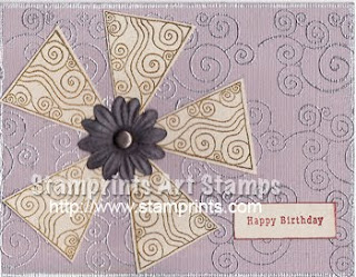
...or a roof!

Other stamps used:
KI-A20 Klimt Swirls
KI-A26 Klimt Rectangle
Hero Arts
7gypsies
What looks just like a triangle (KI-A21 Klimt Triangle)...

...could also be flower petals or an asterisk...

...or a roof!

Other stamps used:
KI-A20 Klimt Swirls
KI-A26 Klimt Rectangle
Hero Arts
7gypsies


